Windana is a community-founded drug and alcohol recovery service that supports adults and young people across Victoria. Following the development of a new five-year strategy, the organisation needed a refreshed brand that better communicated its purpose, values and role in supporting recovery journeys.
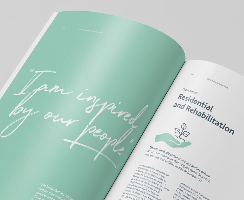
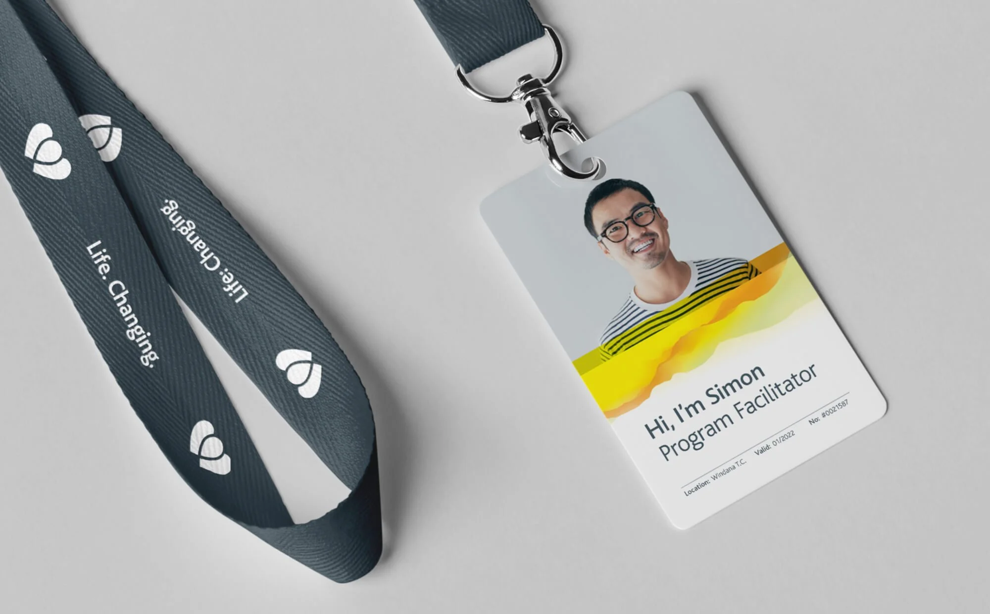
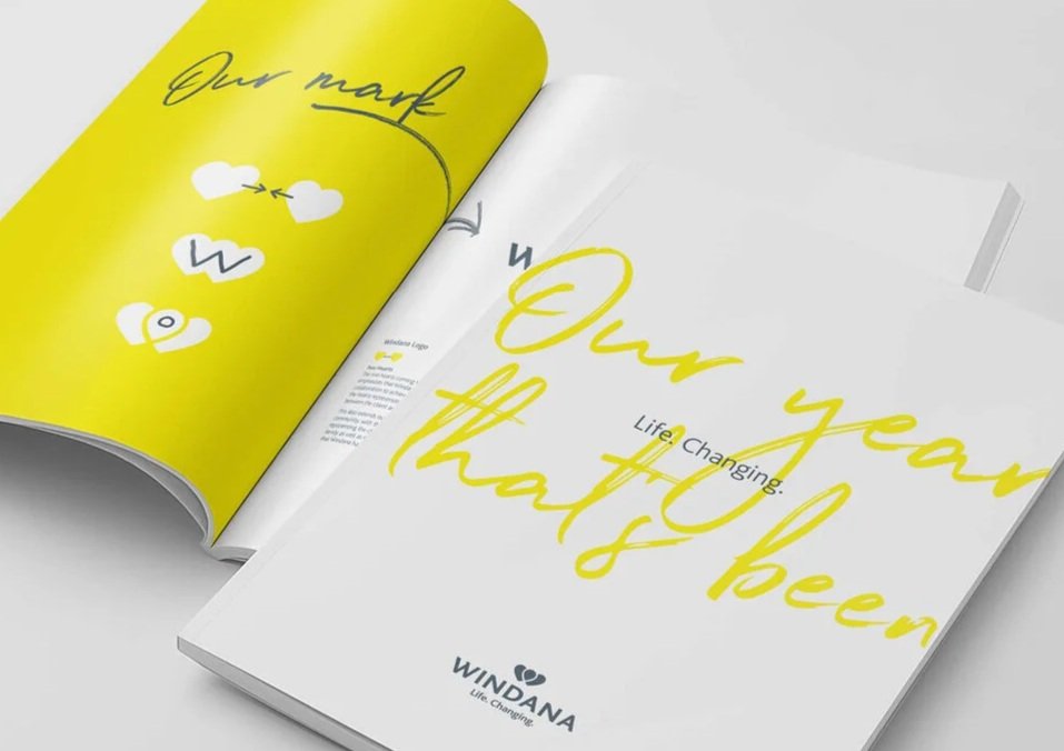
Research with staff, clients and local communities revealed that recovery happens through a combination of personal effort and meaningful support. This insight informed a new identity centred on two hearts merging to form a “W”, symbolising the relationship between Windana and the individual. The mark also creates a location pin, representing Windana as a place of guidance, choice and support. Hand-drawn elements, warm colours and the strapline “Life. Changing.” further reinforced themes of individuality, transformation and hope.
The result was a compassionate and distinctive brand identity that reflects Windana’s commitment to empathy, personal growth and community support, while bringing its new strategic vision to life.